14
Dec
6 tips for creating a visible poster
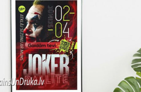
A poster is one of the first marketing tools to attract consumer attention. It is an effective way to draw attention to store sales, scheduled events, special promotions, or simply important announcements.
Possibly the hardest task in creating a noticeable poster is combining attractive and artistic graphics with text, and creating it in such a way to include a call to action. Although there is no one specific method for making posters, there still exists a practice in poster design that is recommended to follow.
These tips can be practically used for any poster being designed:
1. Choose the right sizes.
A poster is a large-format print material created to attract attention. Before you choose the right poster size, it is important to decide where it will be displayed. If the poster will be placed on a wall with many other posters or on a crowded background, print it in a larger size to make it stand out. Conversely, if the poster is going to be placed on a relatively bare wall, print it in a smaller size and try to place several of them side by side to leave a stronger impression. For posters that you plan to print, it is best to use international poster sizes.
Standard poster sizes are:
A1 (594 mm x 841 mm) = large poster;
A2 (420 mm x 594 mm) = medium poster;
A3 (297 mm x 420 mm) = small poster;
If you plan to print non-standard posters or, if you want to learn more information about poster printing and its sizes, contact us!
2. Plan the purpose and target audience of the poster.
Before you start creating a poster, put some things on paper as a draft to better understand for whom and with what message you are creating the poster. Create design goals and tasks that you want to achieve with your poster. This is a very significant point for the poster to convey the intended message. The three most important questions to consider are:
What is your brand image and how will you show it?
What is your poster's target audience?
What is your poster's message that you want to convey to the target audience?
3. Arrange the poster layout.
The chosen target audience should be able to understand the poster's message. Choose the alignment of poster elements – to the right, to the left, or centered – and use it for writings, photos, text, and shapes. Elements in the poster must be coherent, meaning that objects and text need to be coordinated. Text is often centered, which creates a sense of symmetry. If the poster is intended to announce an event, then more detailed information should be included:
Title;
Event date;
Information on prices, including discounts for early purchases;
Event rules;
Parking location;
It may seem like a good idea to put as much information as possible on a poster. However, remember that less is more when it comes to posters. The more information displayed, the greater the risk of confusing the readers.
4. Choose the poster colors.
The choice of poster colors, likely, will be the first thing the audience will notice, especially from a distance. That is why it is important to choose the right colors. Combining suitable colors is one of the basic principles in visual design, however, selecting appropriate colors can take a long time if you are not familiar with color theories.
One of the simplest and yet most effective is the 60 - 30 - 10 color rule. Essentially, one of the primary colors: red, blue, or yellow is chosen as the main color. Then two supplementary colors are selected. Use a tool like Adobe Color, it will help determine the supplementary colors.
The main color should take up about 60% of the poster
Share this post
RELATED
Posts
Large format posters for advertising your business: step by step instructions
Learn how to create large-format posters with clear design, proper materials, and placement to enhance company recognition.
read more
Sticky Notes Printing: 5 Tips for Creating a Noticeable Design
Learn how printed notebooks increase your company's recognition with quality design, materials, and effective communication.
read more
What do you need to know about flyer printing to achieve excellent results?
Learn about effective flyer printing: the right design, material, and color selection increases customer attention and brand recognition.
read more


