


4
Aug
Professional Letterhead Design to Build Trust
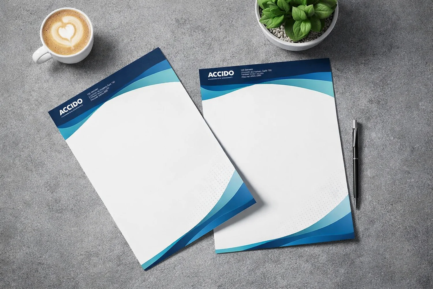
A few years ago, a major real estate deal almost collapsed for a seemingly trivial reason. The contract was printed on thin paper with a blurry, low-resolution logo. The client instantly doubted the partner's professionalism. Can one piece of paper really affect a carefully built reputation? The answer is a firm yes. Quality letterhead design serves as a silent messenger. It influences perception before the document is even read. The first contact with printed materials leaves a lasting impression.
Researchers have discovered a surprising fact about the human brain and perception. Information read on high-quality, tactile material is perceived as more important and reliable. This is tactile memory gently manipulating our subconscious. Imagine a meeting situation. "The offer looks great, but why is the logo stretched so strangely?" asks a potential client. Visual inaccuracy instantly undermines trust. A carefully crafted visual identity shows that a company truly values its partners.
Why Letterhead Design Builds a Strong Brand Image
Excellent results always start with the right technical foundation. Initially, it seems simple – place a logo in the corner, add details, and you're done. In reality, professional letterhead design requires deep knowledge of composition, white space, and typography. It is a delicate balance between aesthetics and functionality. It must never distract from the text. Font choice plays a huge role. A classic serif font evokes tradition and reliability. Meanwhile, a modern sans-serif font indicates innovation and dynamism. A common mistake is using low-quality images taken from the internet. To ensure graphic details look sharp and clear on paper, a vector file is required. What exactly is a vector file? Simply put, it is a digital image made of mathematical lines and shapes, not individual pixels. Such a file can be scaled to any size without losing quality. This guarantees a flawless and professional print every single time.Real Example: How Visual Style Affects Sales
Some time ago, a small law firm had excellent experts, but their closed deals weren't increasing. When sending contracts, they used a standard text editor without a unified structure. Fonts were inconsistent, and the documents looked chaotic. They decided to completely revamp their company's visual document style. Within three months of introducing a new, unified layout, client trust metrics improved rapidly. The new design included an elegantly embedded watermark and clear typography. Clients admitted that the collaboration now felt much more prestigious. This real story perfectly illustrates how strongly details can influence decision-making.Practical Tips for Successful Print File Preparation
The printing process can hide unpleasant surprises if files aren't prepared properly. Most often, clients face color mismatch issues. Computer screens display colors in the RGB (red, green, blue) model. However, printing equipment uses the CMYK color model. If the design isn't converted, bright blue on screen might turn dull gray on paper. Another important aspect is safe zones and bleeds. Paper cutting is never 100% precise. Therefore, elements extending to the page edge must be slightly larger than the final format. This prevents white lines from appearing along the edges. The safest format for file delivery is PDF. This format "freezes" the design, ensuring no letters shift. It guarantees the intended result will exactly match your original idea.Material Selection for Smart Cost Optimization
Saving money on material quality sometimes means risking your reputation. Standard 80-gram office paper is perfect for internal use. However, for official contracts, choosing 100 or 120-gram material is recommended. It is less transparent and creates a much more solid impression in hand. Quality paper is like a well-tailored suit for your most important document. Thoughtful letterhead design also includes choosing the right paper tone to harmonize with corporate colors. A warm white or striking snow-white tone subconsciously changes brand perception. By combining this with the right printing technology, you can achieve an excellent balance between price and quality. Furthermore, if documents are frequently mailed with booklets or catalogs, it's crucial that all these printed materials form a cohesive, unified ensemble. Planning orders long-term makes significant savings possible. By printing larger runs using offset technology, the cost per unit drops drastically. If a small volume is needed for an exhibition or a quick project, digital printing is the smarter choice. Here too, an experienced print specialist will help find the best way to optimize your budget without compromising on quality.Final Thoughts on the Power of Printed Identity
In our digital daily lives, where emails pour in endlessly, physical and beautifully designed paper becomes an exclusive communication channel. It serves as tangible proof of a company's high standards and respect for details. A thoughtful and precisely executed visual layout helps your business stand out among competitors. What do your company documents look like right now? Do they truly reflect the excellence you provide to your clients every day? Perhaps it's the right time to improve your approach to printed materials. Start with a compelling design and partner with a knowledgeable print shop that can turn ideas into perfect results. Let's create materials that speak for themselves!Share this post

RELATED
Posts

How do paper bags with a logo attract new customers?
Discover how paper bags with a logo boost brand awareness. Read practical design and printing tips to attract new customers.
read more

How Custom Sticker Design Will Boost Your Brand Value
How does custom sticker design boost brand value? Discover practical tips on file preparation, materials, and design impact.
read more

Effective Leaflet Design: 7 Steps to Results
Learn how effective leaflet design attracts new customers. Discover 7 proven steps for excellent print results!
read more