2
Jun
Effective Leaflet Design: 7 Steps to Results
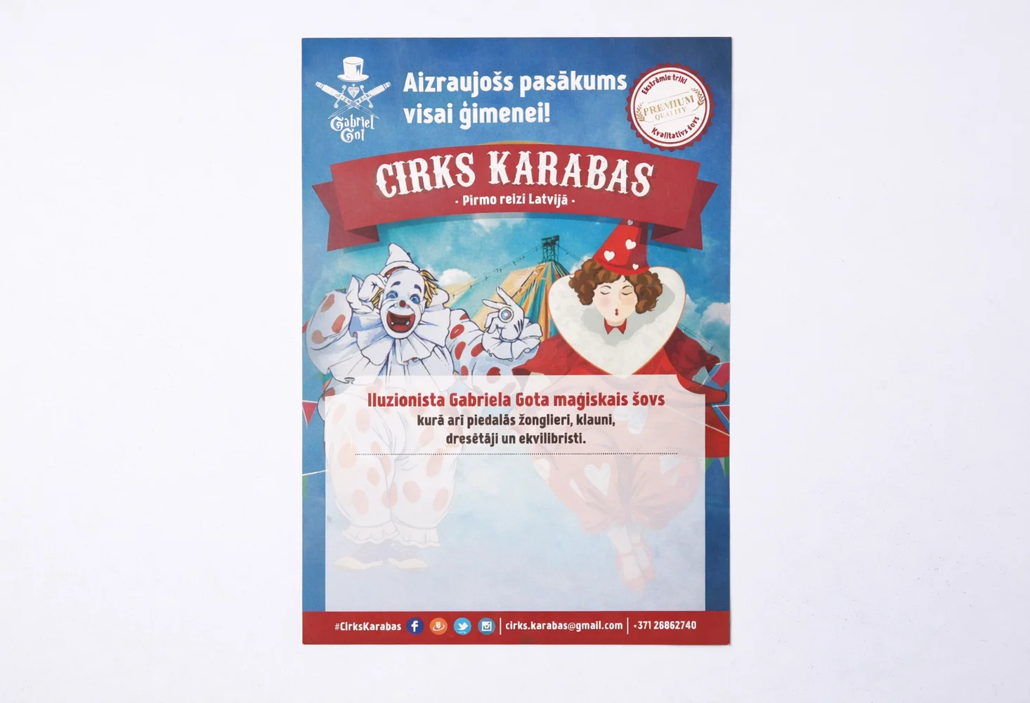
On city streets, we often see people hurrying by and ignoring ads. Did you know the average consumer decides to toss a handed-out flyer in just half a second? Why do some materials instantly grab attention while others end up in the trash? The answer lies in a thoughtful approach. Creative and strategic leaflets design is the key to achieving your goals. It is no longer just a colorful piece of paper. Today, it is a powerful sales tool that can significantly boost brand awareness. Smartly planned content and proper technical execution will help you stand out among competitors. Let's look at seven important steps for outstanding results.
1. Successful leaflet design starts with a goal
A common mistake is creating visuals without a clear goal. Too much information in one place quickly creates chaos. Do you want to attract visitors to a new store? Maybe the goal is to sell an innovative service? Professional leaflet design requires clearly defining the main idea. A single strong message always works much better than ten different offers. Understand your target audience and their needs. What exactly do they want to hear? Once the basic goal is clear, the visual design becomes a logical continuation. Start with a strong plan before picking colors.2. Grabbing attention with a headline
The headline is undoubtedly your most crucial opportunity. It acts as a hook that instantly catches the eye. Imagine a street dialogue: "What is your biggest challenge?" - "Lack of time!" If an ad promises an immediate solution to this problem, the reader will keep looking. Try to avoid boring and generic texts. Use active words and spark natural curiosity in people. In practice, intriguing questions or surprising facts work exceptionally well. The headline must be visually noticeable and easy to read from a distance. If a person misses the main idea in the first second, they will move on.3. Creating a thoughtful visual hierarchy
The human eye automatically scans information from top to bottom. A proper visual hierarchy seamlessly guides this gaze in the right direction. Place the most important information in the most visible spots. Use different font sizes to clearly separate headlines from descriptive text. Be sure to leave enough free space or "air" around graphic elements. Empty space on a page is never a mistake. It helps highlight the essentials. A cluttered and heavy design quickly tires and repels a potential client. Structured content helps information reach the recipient's mind and heart much faster.4. The psychological power of colors and fonts
Have you noticed that fast-food restaurants often use red and yellow? This is no accident. These warm tones stimulate appetite and quickly attract attention. Colors and fonts create the first emotional impression even before words are read. Blue tones create a sense of peace and reliability. Green tones associate perfectly with nature and growth. Choose no more than two or three different fonts to maintain a professional look. Careful font matching is an extremely important part of a successful visual story.5. Technical details and file preparation
Even great design can fail if not properly prepared for printing. This is when technical terms become crucially important. Excellent typography quality requires vector files and high-resolution photos. Always save files in PDF format, as it safely preserves the exact layout. Do not forget about the "bleed" function. These are vital extra millimeters on the outer edges of the design. They protect against white lines during the cutting process. Careful technical preparation prevents very expensive mistakes. Check everything before sending files to production.6. Paper selection and physical perception
An often forgotten fact: paper weight and texture directly affect perceived product value. Paper that is too thin can instantly create an impression of a low-quality offer. Conversely, thicker, glossy, or matte material immediately signals prestige. Interestingly, people keep physically pleasing and high-quality materials much longer. Choose the material that best matches your unique brand image. Recycled paper works perfectly for eco-friendly brands, highlighting company values. Always consult with printing experts to find the most suitable solution for your budget.7. A clear call to action (CTA)
Even the most beautiful visuals are useless without a clear call to action. What do you want people to do after reading? "Call us!", "Visit our website!" or "Use the discount code!" are working examples. Visually highlight this call with a bright color or a larger font. Make this next step as simple and understandable as possible. People like clear and unambiguous directions. If the flyer creates an immediate desire to act, the goal is fully achieved. Thoughtful leaflet design logically concludes with such a strong call.Summary for a successful result
Creating quality print materials is both an exciting art and an exact science. It requires careful planning, an understanding of psychology, and technical knowledge. By following these seven practical tips, you can create materials that truly work for your business. Smart leaflet design will help successfully convert passersby into loyal customers. Remember that every little detail shapes the overall story. From a loud headline to the thickness of the paper, everything matters. Are you ready to surprise your target audience with your next campaign?Share this post
RELATED
Posts
5 Reasons Why Ordering Flyers Online is Fast and Convenient
Discover 5 reasons why ordering flyers online is a smart business decision. Save time and get excellent print quality quickly.
read more
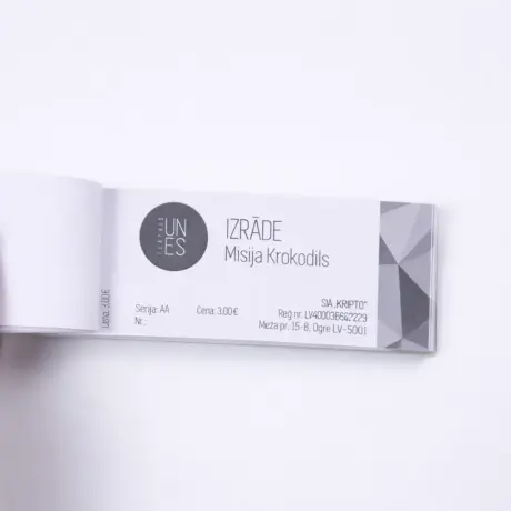
How is the ticket printing price calculated for your next event?
Find out how the ticket printing price is calculated. Practical tips on design files, materials, and security to smartly save your budget.
read more
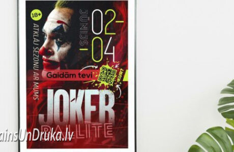
Large format posters for advertising your business: step by step instructions
Learn how to create large-format posters with clear design, proper materials, and placement to enhance company recognition.
read more